Courier 96

cropped-COURIER96_logo.jpg
Client: Medical start-up from Wrocław.
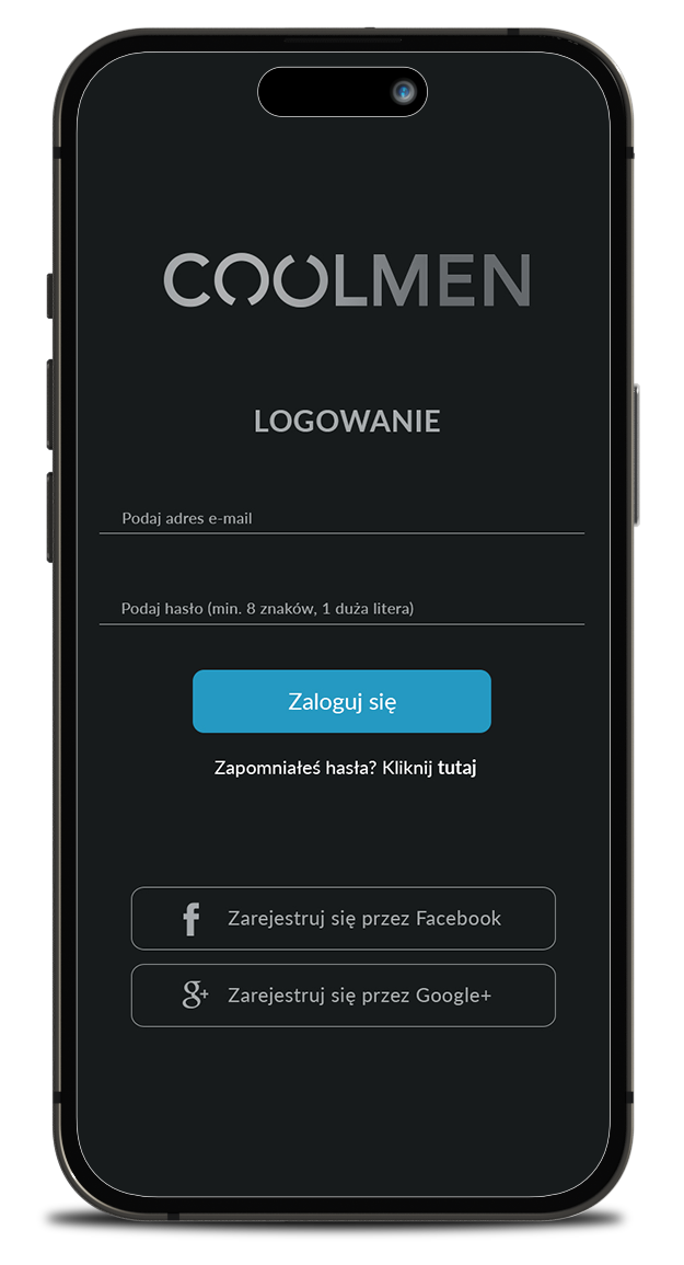
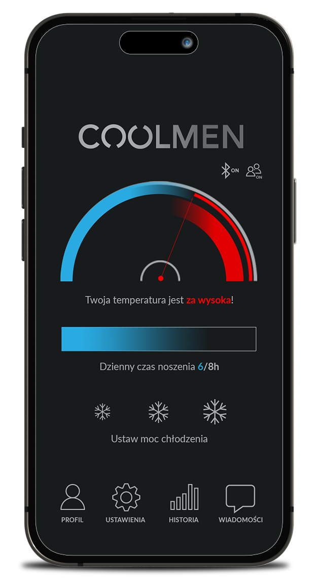
Objective:
Corporate identity development for the COOLTEC brand and an innovative device supporting male fertility – COOLMEN.
Realization:
– Creating a minimalist, modern, discreet and masculine logo for an innovative male-fertility support device – COOLMEN.
– Development of the layout of the mobile application integrated with the innovative supporting device male fertility – COOLMEN.
– Implementation of a comprehensive image project of the COOLMEN brand – website lifting.
A closed graphic form that is a combination of the letters C and M. The roundness of the letter M evokes the association with rotor blades. The C enclosed inside is the nucleus of the composition, in which one element is protected/touched by the other.
The shape of the letter M, wrapped with the letter C, is associated with the cutouts in a gladiator’s mask, emphasizing the fact that the brand is made for men.
Color scheme: the letter M in a cold steel shade with a gradient. The letter C in blue indicates the cooling process.
The logotype written in capitals inspires confidence, the letters „o” by breaking the outline let air in, which brings to mind the cooling process.

WEBSITE

COOLMEN_monitor2
COOLMEN_monitor3
COOLMEN_monitor4

APP GRAPHICS