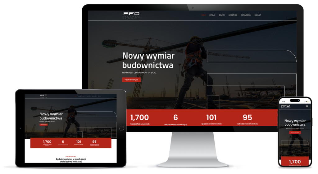
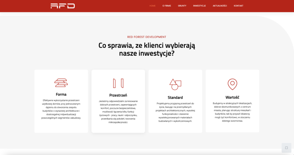
Red Forest Development develops projects with consistent aesthetics, offering customers functional residential units in the form of elegant, modern blocks. Redefining the style of intimate, urban estates, the company combines its image with a minimalist logo with an architectural flair and a sporty flair. The fast-paced construction team is confidently tackling the next stages of realizing the „F” of their dreams.